The Challenge
How do you design one comprehensive website that will appeal to, and convert, three distinct user groups?
Overview
DOMMMA's creating an App that will be an all-in-one solution to how Landlords, Tenants, and Contractors find and interact with each other online. I was hired to redesign their landing page.
UX/UI Designer
Jayraj Panchal, CEO
Aaron Janes, Sr. Developer
Amir Khamesy, Jr. Developer
Verity Griscti, UX/UI Designer
80 Hour contract done part-time over two months.
Understanding Things
Organizational Research
I went into this project knowing next to nothing about property management or property listing companies. I had several in-depth conversations with DOMMMA's CEO, Jayraj Panchal, to make sure I understood the start-up's services, target audience and unique selling proposition.
DOMMMA is building a Progressive Web App with 3 target users, each with a different reason to visit DOMMMA's webpage. Since attention spans are short, it's important each user group quickly finds the information they need.
Unique Product Offering: Assignment Listings
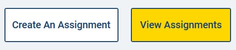
DOMMMA offers tenants a service called an Assignment Listing . Assignments let tenants legally transfer the remainder of their lease to a new tenant without breaking their lease or taking on the legal liabilities of sub-letting.
App Features By User Group
Landlord
- List Properties & Vet Potential Renters
- Ongoing Landlord/Tenant Communication Tools
- Document Storage Features
- Rental Listings Pricing Plans
Tenant
- Search Available Properties
- One time application applied to multiple properties
- Record of all communication with Landlord
- How and when to assign a lease
- Assignment Pricing
Contractor
- Register company for future client leads
- (Not the focus of Minimum Viable Product)
Evaluating the Existing Website
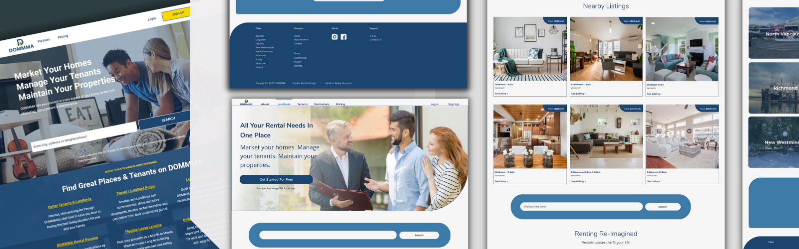
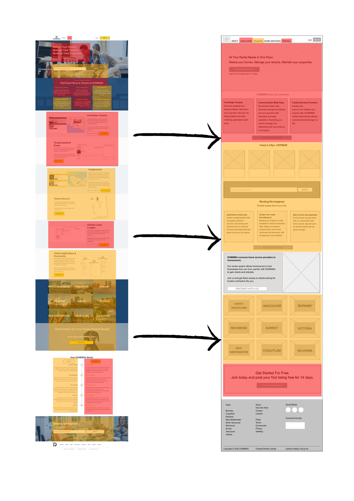
Next, I looked at the existing website. While scrolling down the webpage reading the content, I found relevant information about DOMMMA's app for all three user groups, but there was no clear story or hierarchy as to how that information was arranged . The home page contained about 1000 words and took over 7 minutes to read in full . Much of the information was repetitive or unnecessary, depending on my user goal.
Web Accessibility Issues
There were a number of accessibility issues with the original website. The most concerning, from a redesign perspective being the brand colours. The blue text on yellow buttons did not have enough contrast and could be difficult to read for colourblind users.
The site was also too reliant on looping gifs of the apps screencast, with no pause or stop button, and the text within the gifs was an unreadable size on smaller screens.
All of the images had empty alt tags, which is bad for accessibility and SEO.
Recommendations & Initial Wireframes
I made the following recommendations based on my analysis of the DOMMMA's business objectives and the existing website.
- Have each section of the site and primary CTA clearly labeled and accessible in a static navigation bar.
- Reorganize/rewrite all the text and clearly group content by user type.
- Remove repetitive copy and trim word count on the site overall.
- Include an About section and social proof, as it's important for new businesses to establish trust with their audience.
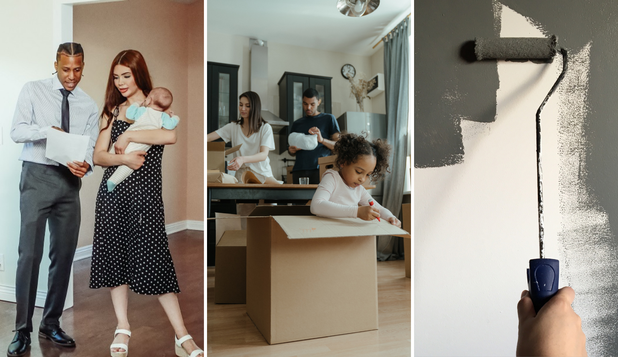
- Replace the looping gif images with stock photos sourced from the company's professional Canva account or licensed under Creative Commons. This solution met DOMMMA's time and budget constraints.
- Create a web-accessible colour palette for use on the web page, app and digital marketing. (The company wished to preserve the existing colour scheme as much as possible.)
- Make a general homepage and tenant-specific pages that could be used to build marketing funnels later on.
The mid-fidelity wireframes focused on re-organizing the site's content.
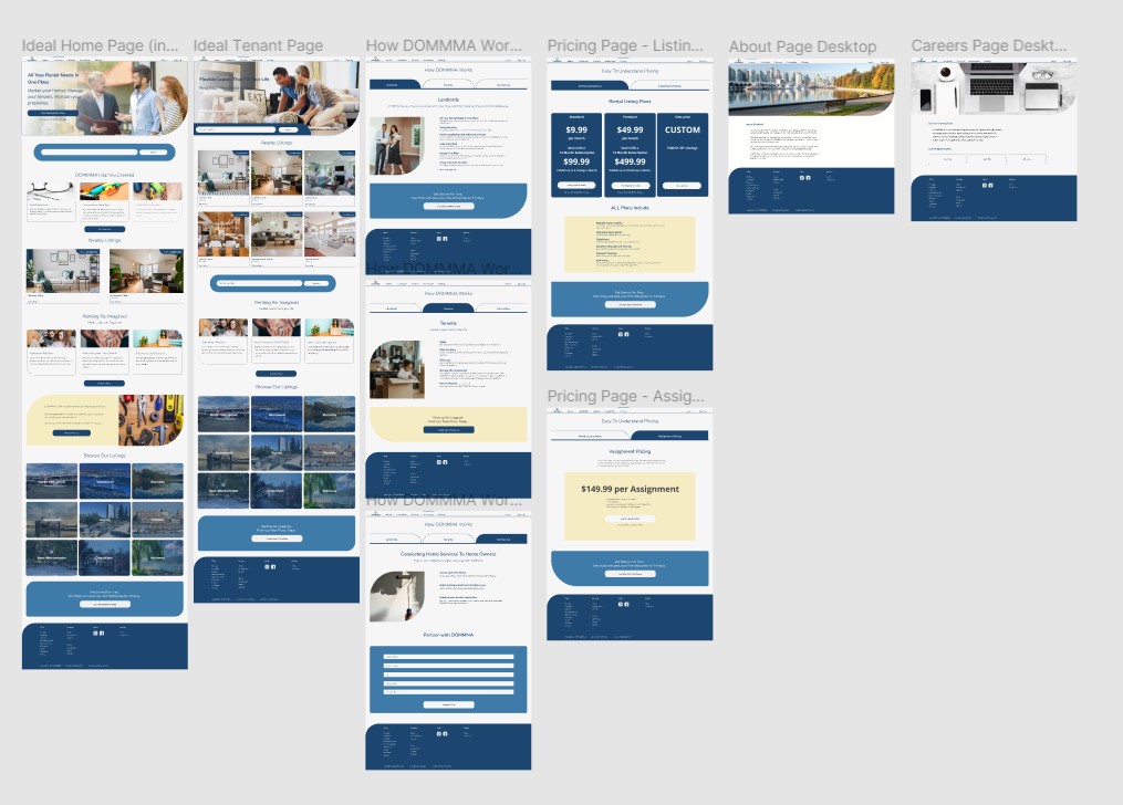
High Fidelity Wireframes
Some light edits were made to the copy before moving to the high fidelity wires. Most notably, Home Service Providers was shortened to Contractors. The original wires also kept the Pricing and How DOMMMA Works pages to a one-page scrolling layout, but it was decided to arrange the information in tabs so users wouldn't be presented with information that didn't apply to them.
DOMMMA's colour scheme was adjusted to meet accessibility standards. I used curves and photography to visually distinguish the site from other rental apps, which seemed to preference hard edges, drop shadows and vector art. The wide use of stock images wasn't ideal, but unique photos could be used in later versions.
Feedback & Critique
DOMMMA is a start-up on a strict budget, and there was no budget for a formal test. A link to the Figma prototype was informally sent out to a few people who were asked to review it and answer a few questions in a Google Form afterwards.
Six people got back to us.
All 6 respondents:
- Noticed that new Landlords could post their first listing free for 14 days.
- Reported that it was easy to find DOMMMA's pricing information.
- Stated that they clearly understood what an 'Assignment' was and how it could benefit tenants. This was encouraging as 4 people said they hadn't heard the term before.
The hero image on the general landing page still seemed too Landlord orientated to one respondent:
"It worked well. I thought if you are promoting "assignment" the first hot page seems very landlord oriented at the top. If I was a tenant I would perceive your value on this site weighted towards the landlord and not towards the tenant. The tenant only sees value once they dig into the site and see the meat and potatoes. :)"
We decided to address this problem by making the hero image a carousel, with one image geared to Landlords and a second geared to Tenants.
Re-Worked Layout
Having users navigate from Landlords and Contractors on the navigation page to their relevant "How DOMMMA Works" section seemed confusing and not nearly as visually appealing as the Tenant page. So I scrapped it and created a dedicated one-pager for Landlords and Contractors too. Organic traffic would find a home page that gave basic info on all three user groups. But, marketing funnels aimed at specific users could then link directly to the target users page.
Next Steps
I worked closely with the development team building the page in React, but the site never went live. The start-up has been placed on pause for the time being.
If the project had continued:
I would have advocated for broader user testing. The site navigation could be tested in Maze or Useberry. But I'd like to make sure Tenants properly understand what an Assignment is and that DOMMMA makes it easy to filter properties by length.
I would have monitored the site's web traffic with Google Analytics. Are the site's visitors spending more time in the Landlord or Tenant sections? Where are they coming from? What is the conversion rate?
Future iterations and recommendations would be based on the above observations.
Lessons Learned
Don't rely on informal testing and feedback, even on small budgets. Advocate for Maze or UseBerry, explain the value of these tools to the client.
Consider the overall marketing strategy when designing commercial websites. Think beyond just how branding will influence visuals. How will the marketing funnel affect the layout and information hierarchy?