The Challenge
How do you help adult guitar students, who are short on time, memorize the fretboard, notes and chord theory to move from beginner to intermediate guitar players?
Entrepreneurial Side Project
Verity Griscti (solo project)
Concept to High Fidelity Prototype in 6 Weeks.
Background
"Fender’s guitar-instruction app, Fender Play – which offered several free trials over the lockdown period – saw its user base increase from 150,000 to 930,000 between late March and late June, with close to 20 percent of the new users under 24, and 70 per cent under 45."
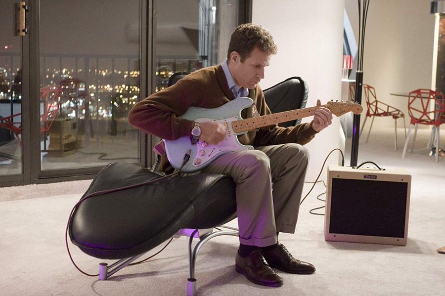
During the pandemic, I dusted off the guitar that had been hiding under my bed for years and began the slow process of relearning the instrument. I was not alone, all major guitar brands and music retailers recorded record-breaking sales in 2020, and online learning Apps and YouTube instructors reported a massive increase in subscribers.
I was also looking for an idea I could take from concept to design and eventually into development to gain a comprehensive understanding of digital product creation. Developing a guitar learning App seemed like a relevant project to take on. There is currently a strong desire for digital learning tools and not many available solutions.
Discovery
Designing for an App
This was my first experience designing for an App, and I looked at both Material Design and Apple's HCI guidelines for direction on things like font sizes, touch sizes and thumb zones.
As I plan to create this app myself, as a side project. I decided to focus on Android as there are no upfront costs to development.
Designing for Microlearning
After reading several articles on micro-learning I concluded that a successful microlearning app should contain the following:
- Training Sessions should be short and focus on a single idea or concept.
- Training Sessions should be interactive , to encourage memorization
- Graphics should be minimal and non-distracting , so the mind's focus stays on learning the content.
What’s Out There Already?
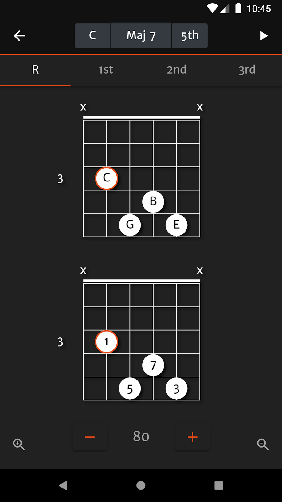
❌ Static Interface
❌ Busy UI. More a game than a learning tool.
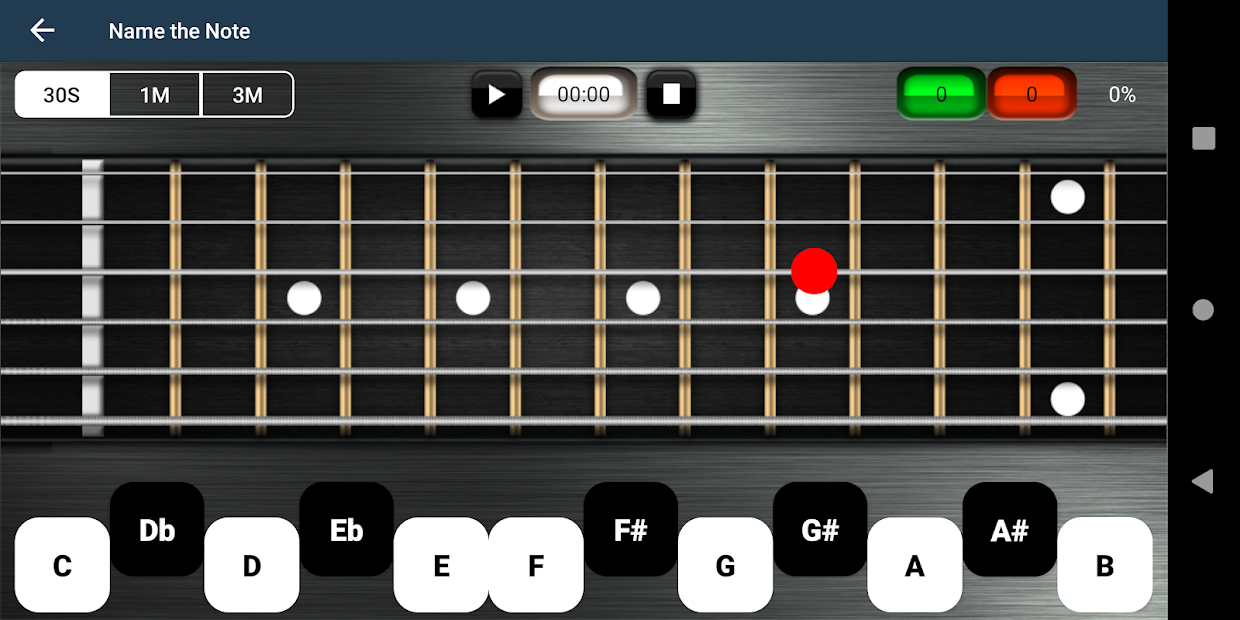
❌ Layout of answer buttons matches chromatic note sequence. Encourages recognition rather than recall.
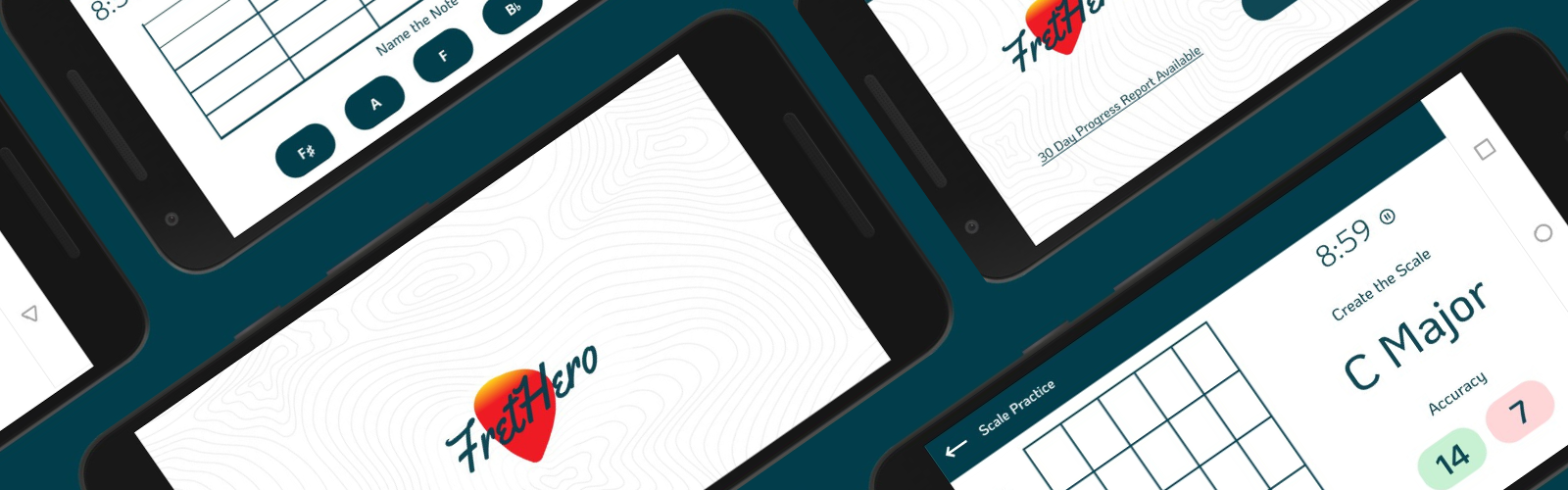
The goal of fretboard memorization and studying scales is to gain instant recall of the notes on the fretboard and how the notes relate to scales and chords.
While several fretboard learning Apps are already available, none are designed to encourage recall over recognition . Most have static and unengaging interfaces. Essentially acting more as digital flashcards than a fully interactive user experience. I wanted FretHero’s UI to encourage recall and memorization as that better assists the users goals.
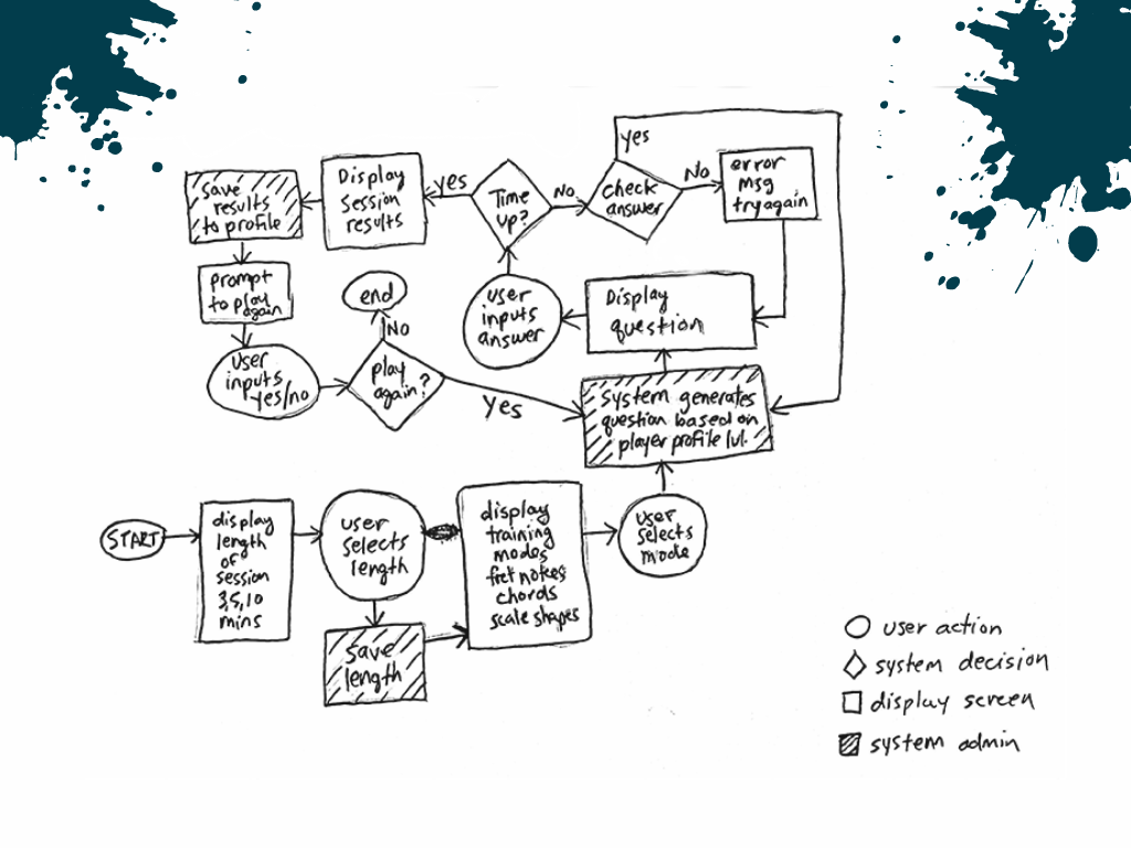
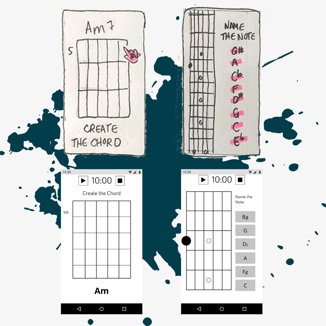
Flows to Wireframes
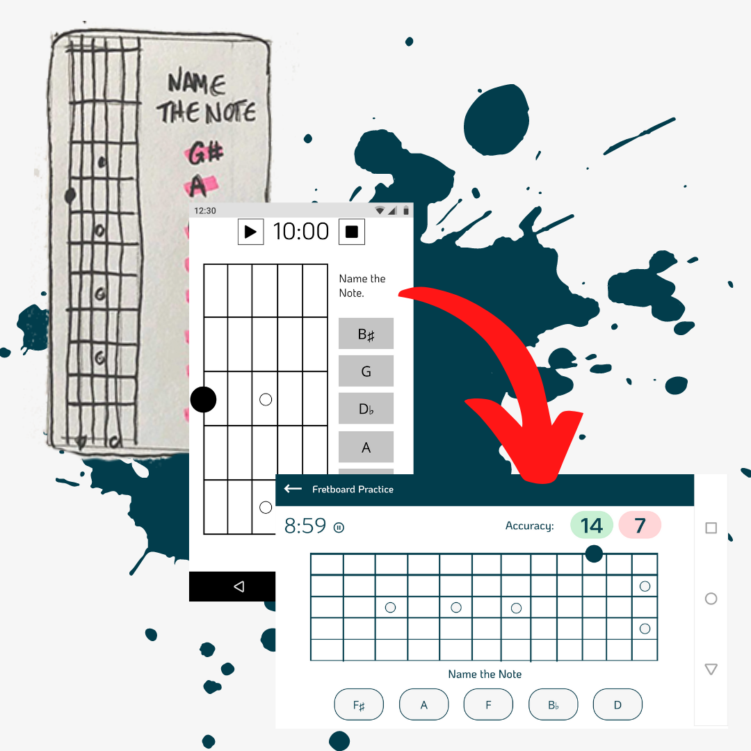
I sketched the main user flows and made low-fidelity sketches of the key screens. The sketches were cleaned up and refined in Figma then linked together into an initial prototype.
Early Tests
I tested my prototype out on 3 participants with a range of ages and levels of musical education. They all intuitively knew how to input answers to all three types of training questions, which was very encouraging.
Who I Tested
| Tester | Test Environment | Education | Music Background |
|---|---|---|---|
|
Female
9 yrs old. |
In Person | Grade School | RCM Summer Camps: Ukulele, Piano, Percussion |
|
Male
45 yrs old. |
In Person | Doctorate | High School Music: French Horn, Choir. Private Lessons: Piano. Self-taught beginner guitar. |
|
Female
66 yrs old. |
Remote via Zoom | Professional Certification | High School Music: Viola. Private Lessons: Piano. |
The tests uncovered three usability issues:
- The Video and History icons in the navigation bar were misinterpreted
- The ability to name a saved video was overlooked (big oops!)
- The copy in the Training results area was unclear or not detailed enough.
Getting Pretty
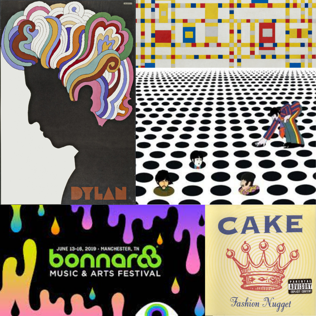
I created a mood-board, to get a sense of what aesthetics would best associate with a music App. I noticed repetitive use of abstract curvy shapes, casual looking fonts, linear gradients and bright colours. Music-related visuals tend to be very busy, but my design had to be minimal and translate well on a small screen. I found myself gravitating towards imagery that made good use of white space and graphics originally designed for smaller CD booklets.
My initial designs were portrait, but that meant the tap points on my intermediate fretboard UI would be too small on the smallest screens and create usability issues. Not wanting users to flip their phones within the App experience, I redesigned all my screens for landscape orientation and was pleased to find that the results opened up all my designs, which had felt cramped in portrait mode.
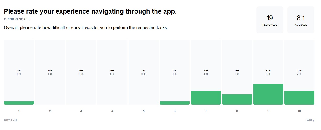
Prototype Tests & Refinements
I ran the second round of testing on Maze. These tests validated that I had fixed my initial navigation and labelling issues
- 90% of testers rated the App navigation experience as a 7 out of 10 or higher.
- 100% of testers stated the icons and labels on the menu screen made sense to them.
When asked if the icons and labels made sense:
"The icons and labeling were quite clear and easy to understand."
"The icons seemed to match the text pretty well, no complaints."
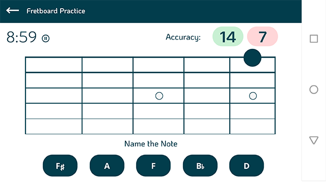
The heat maps revealed some minor confusion over the buttons, which are white on white. I may have gone a bit too minimal here. There were no misclicks in the menu, which is white text on a darker background. I made the buttons darker.
Animation Demo
Here is a quick demo of the refined version with animations.
What's Next
At this point, I am confident the FretHero interface is easy to understand, and I think there is a viable market for this project. I am in the process of flowcharting specific game mechanics.
Lessons Learned
- Early tests will help uncover oversights and assumptions before things get too detailed. This seems especially important when designing alone. There is only so much one pair of eyes will notice.
- Too much visual information can confuse the user, but too little visual information can do the same.