The Challenge
How can an App enhance the usability of a formula-making machine and best assist exhausted parents?
Team Lead
Kevin Andries
Verity Griscti
Marvin Lara
LJ Paraiso
6 Week Capstone Project.
Research & Discovery
Understanding the Organization and Product
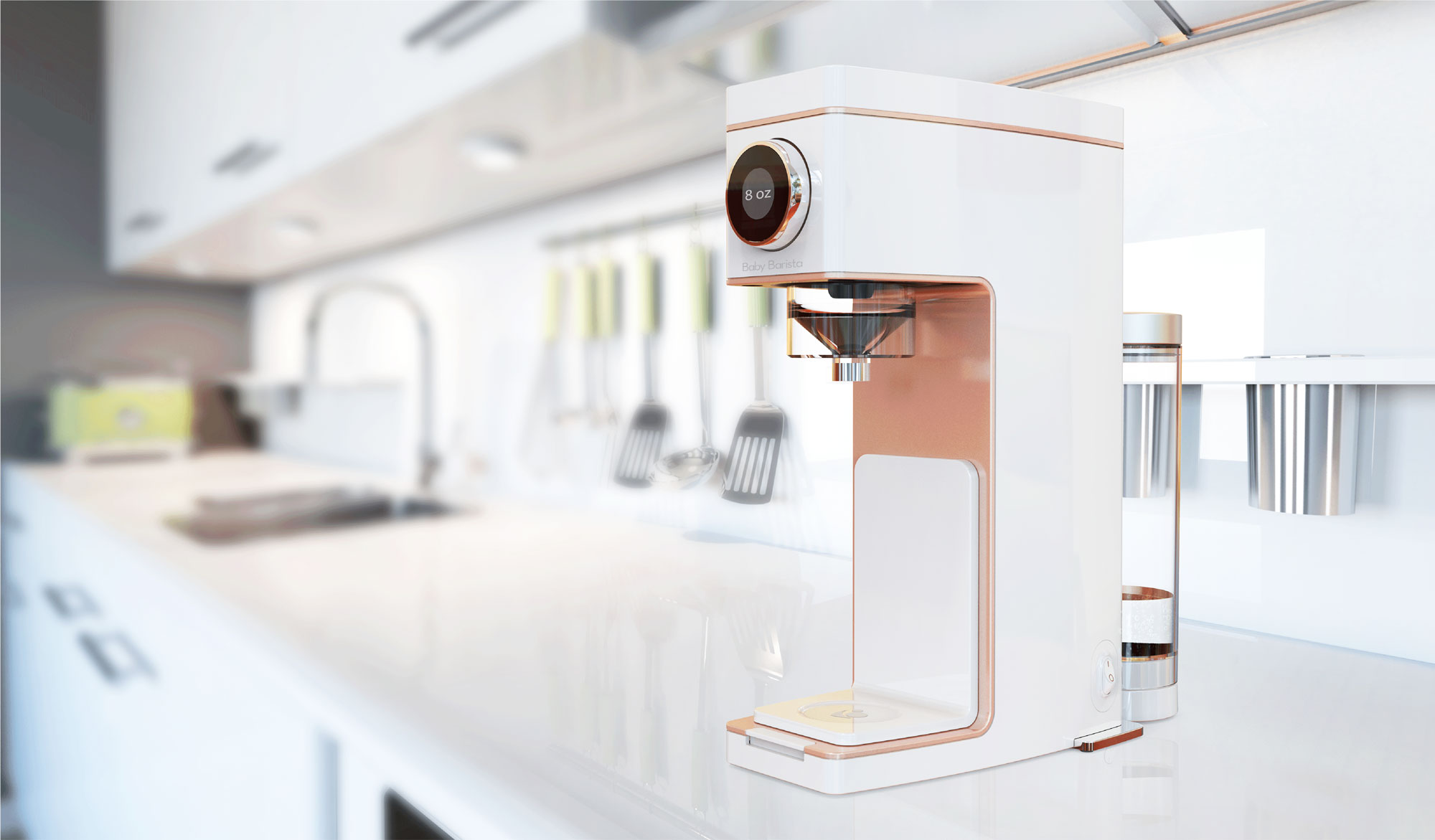
Baby Barista had developed a prototype of their formula maker with RKS Design and had detailed User Personas and a fully fleshed-out business plan in place when we came on board. We reviewed Baby Barista's existing material and met with the Founder and Director of Business Development.
This initial round of meetings and review uncovered several pain points in the feeding experience that the app could assist with:
- Remote bottle prep (achieved by syncing the mobile app with the wifi ready formula maker)
- Feedings tracker
- Manage formula subscription
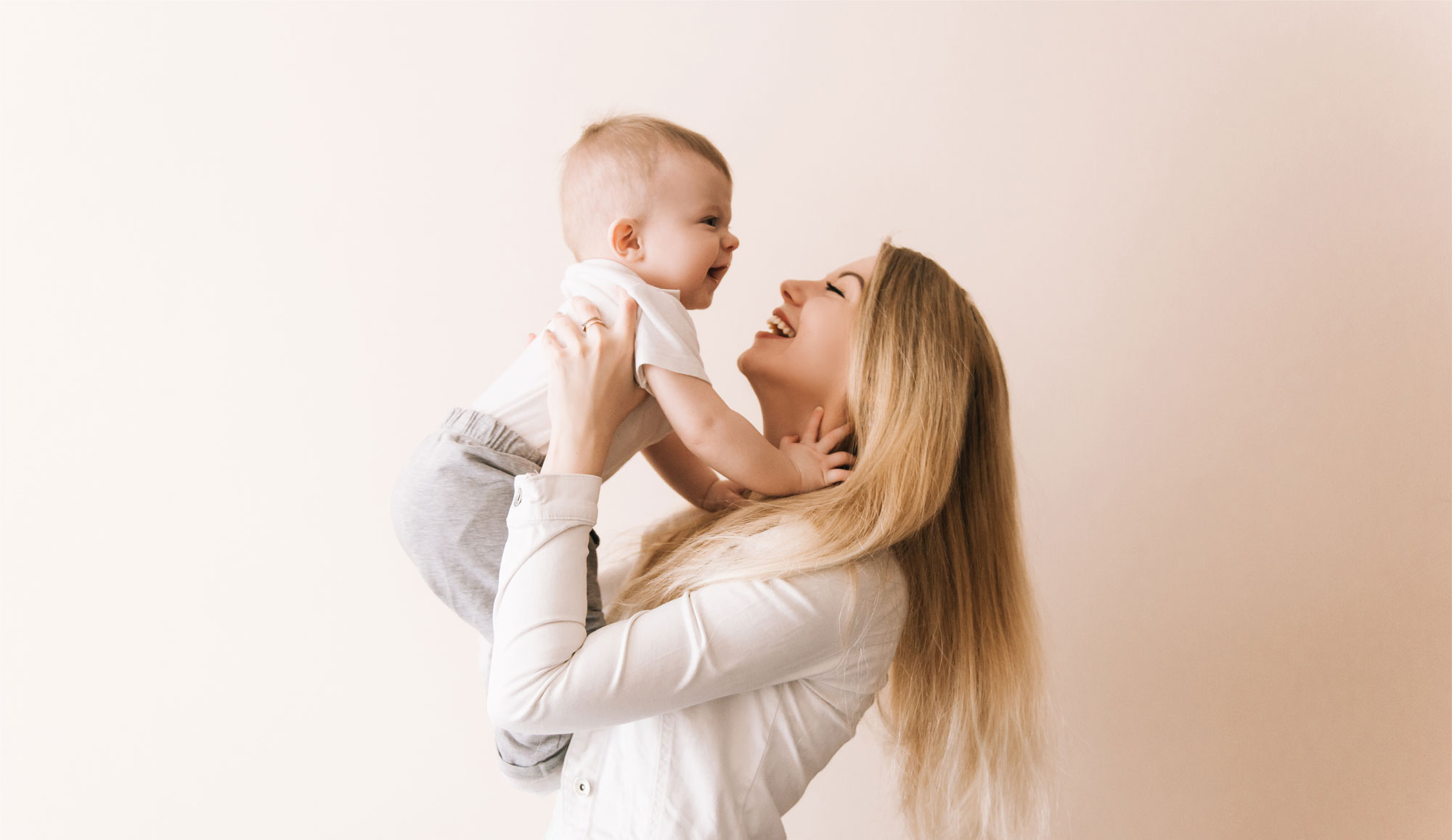
Understanding New Mothers
Our team interviewed 7 new Mothers who have recently breast or formula-fed their infants. The Mothers were asked about their feeding habits and any positives, negatives or other issues associated with feedings. We also had them describe typical scenarios with their infants. Mothers were asked about their familiarity with competitive or similar products and apps, to get a sense of their experiences with existing products.
Concerns
- "What are the cleaning requirements for the machine?"
- "Will travelling with a formula machine be an option?"
- "Does the machine have the correct bottle temperature?"
Desires
- “Would like the ability to start a bottle from bed”
- Alert notifications for cleanings and feedings
- Easy feeding tracking
Formula Benefits
- Easy for spouses, grandparents and other caretakers to feed the baby
- A formula machine with a remote start is most useful for nighttime feedings
- The convenience of bottle feeding makes the cost of formula worthwhile
Understanding the Competition & Baby Product Marketplace
The only other similar product on the market is the Baby Brezza . A formula maker with a companion app that allows remote starts.
This project occurred during a COVID-19 lockdown, and our team could not obtain either a Baby Brezza or a SNOO. We had to rely on customer reviews to try to understand what the baby sleeper, SNOO and the popular apps, Baby Tracker and Baby Connect were doing successfully and which pain points were overlooked.
The main pain point with the Baby Brezza was connectivity and the app being unable to turn on the machine remotely.
"The app might as well not exist, it doesn't turn on the Brezza. You have to turn it on yourself manually to be able to connect the app, and then if you don't start warming the bottle within minutes it shuts off. It also only works in a 20ft radius which is useless when I'm trying to use it from another level of the house or even across the living room. I was so excited for this, and it sucks."
The SNOO baby sleeper was very positively reviewed. The only major pain points seemed to be the apps inability to work with multiple SNOOs in the case of multiple babies and manually logging naps that occured outside the sleeper.
“Everything between the SNOO and the App is smooth and responsive. The interface to manually log naps that occur outside the SNOO is pretty clunky but it gets the job done.”
“We have 3 SNOOS for triplets. Latest update thinks with each separate log in I need to set up the snoos all over again. Suspect login button links to sign up button with no true login button please fix. Workaround: Login to Baby A, see baby A activity, log out baby a, log in to baby b, app wants me to set up baby b again (separate email), when I force close app and open app again it shows baby b info. When I log out of baby b and open baby a wants me to set up snoo again, as above. FIX PLEASE”
A popular feature of both Baby Connect and Baby Tracker was the ability to let multiple users keep track of the same baby.
"I really like the flexibility of the app and that it lets multiple people (so long as they all own the app) track the same child. It makes it so easy for my partner and I to know what has happened even when we can't pass on the information verbally. It is also a great tool for tracking patterns and getting your baby into a routine. The only thing I wish the app did was track when the baby is awake too."
Design Goals
We made a list of several design goals across three categories.
Design & Functionality
- Easily start a bottle
- Haptic feedback/Silent Mode
- Simple UI
- Easily create baby profiles, including multiples
- Alert notifications for timed feedings
- Capacity to track and share information with healthcare workers
- Manage formula subscription within the App
Error Prevention
- Reminder to clean machine
- Alert when bottle has spoiled
- Reminder to check water level after n feedings
- Provide a help center/FAQ with formula education and best practices
Pair with Hardware
- Easily sync App with any Baby Barista, whether new or second hand
- The App needs to 'wake' Baby Barista from sleep mode from the mobile device
- Ability to monitior the water/formula temprature from the App
Moodboards & Early Concepts
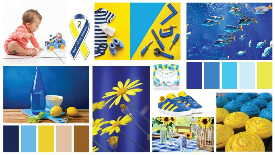
Baby Barista had no branding guide for us to consult on the aesthetics of the app. We presented several mood boards to get a sense of direction on style. Early concepts were developed around two mood boards. One pulled from the earth tones used in the machine, and another used the blue and yellow palette from the Baby Barista website.
.jpg)
From there, we developed a few different concepts exploring different functions of the app.
.jpg)
.jpg)
The client (and the team) favoured the more minimal concept that best reflected the look of the machine.
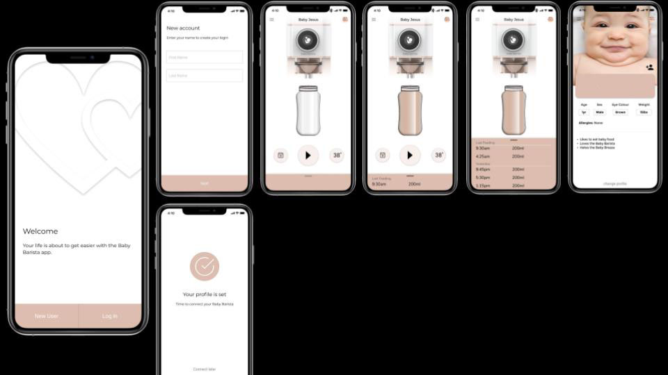
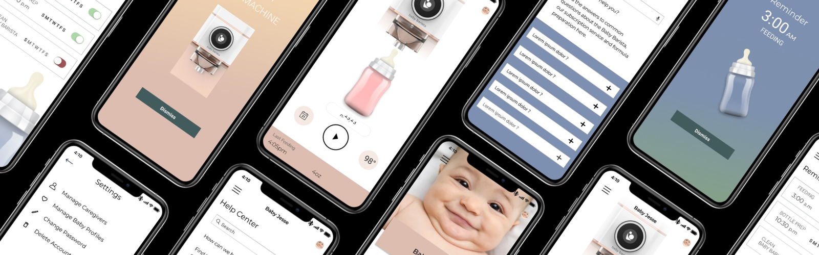
High Fidelity Prototype
We worked in Figma to create the high fidelity wires and a prototype for testing purposes.
Below is a walkthrough of the onboarding proccess. The focus here is on error prevention, and encouraging subscription enrollment.
User Tests
We performed an initial round of user tests in UseBerry and had testers perform 4 main tasks:
| User Task | Findings |
|---|---|
| Remote Start A Bottle. | There was a mild amount of confusion locating the play button. We enlarged it slightly and made the border thicker. |
| View Feeding History. | Users had no problem performing this task. Either via the menu or the calendar icon. |
| Manually Add A Bottle to Feeding History. | This task was easily navigated to and achieved. |
| Edit Baby Profile. | Some users tried clicking the baby avatar on the top right of the home screen. We linked the avatar to the profile section giving users two different entry points. |
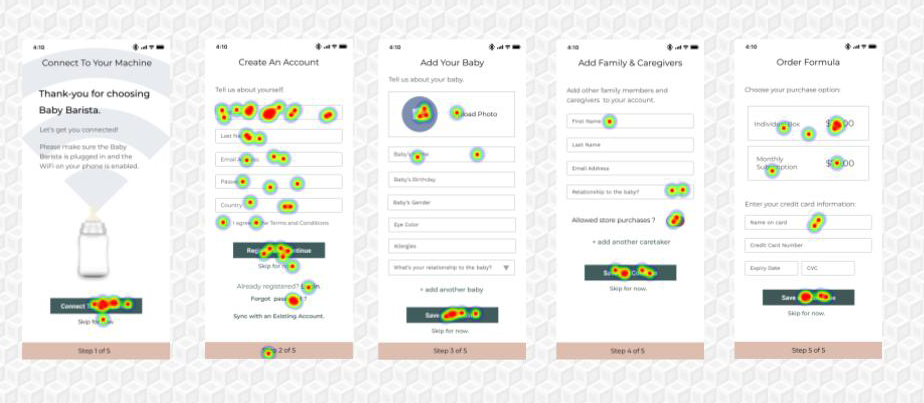
We asked testers to go through each screen of the onboarding experience. The heatmaps determined that users were able to locate the buttons, links and input fields predictably. Overall, users found the onboarding process easy and uncomplicated. However, the onboarding simulation was done without the actual machine present.
What's Next
Create a Brand Identity and Style. Baby Barista was still in the early stages of creating its branding.
Further Testing With The Prototype. Initial tests validated that the app, in and of itself, was easy to use. Further testing with a working prototype needs to be done. Working with the development team to better understand what causes errors at this stage of the user experience would be a logical next step.
Refining the Formula Subscription Section. Baby Barista intends to create a formula subscription service that users can manage within the app. We didn’t user flow or design this segment of the app as the details of the subscription service were still in development and it would most likely mean integrating with a 3rd party solution like Square.
Create Reassuring Content for the Help Section. Every brand and type of formula is slightly different, and the volume of information on formula available to parents is overwhelming and confusing as it conflicts with each other. Creating content for the help section and testing users to ensure the information is comprehensive and easy to understand should be completed before an MVP is launched.
Lessons Learned
- The digital product you're designing is ultimately just one part of the story. It's important to take a broad view and examine the company, the user and the environment the product will be used in.
- You can't design away all technical and human error. A good design anticipates problems and offers assistance.